How to Make a Heat Map in QGIS (and With One Prompt)
Published
A heat map in QGIS turns thousands of points into a smooth surface that shows where they bunch up. QGIS has two built-in ways to make one: the Heatmap renderer, a layer style that draws live and saves nothing, and the Heatmap (Kernel Density Estimation) tool, which writes a raster you can measure, clip and print. When readers need real numbers, a grid of hexagons with a count in each is the better map.
 turns thousands of points into a smooth surface that shows where they bunch up. QGIS has two built-in ways to make one: the Heatmap renderer, a layer style that draws live and saves nothing, and the Heatmap (Kernel Density Estimation) tool, which writes a raster you can measure, clip and print. When readers need real numbers, a grid of hexagons with a count in each is the better map.
I made all three on 11 October 2026 in QGIS 3.44.15, from 6,041 injury crashes involving a bicycle in Paris between 2020 and 2024, then asked an AI agent for the same result in one sentence.
The short answer
| You need | Use | Effort by hand | What I measured |
|---|---|---|---|
| A quick look, no new file | Heatmap renderer (layer style) | 24 clicks, about 1 min 10 s | Redrawn at every zoom, so hotspots change with scale |
| A heat map you can measure, clip and print | Heatmap (Kernel Density Estimation) tool | 38 clicks and 6 typed fields, about 2 min | 250 m radius at 10 m pixels: 1.8 s to compute, 7.3 MB |
| Numbers a reader can check | Hexagon grid and Count Points in Polygon | 55 clicks and 7 typed fields, about 2 min 50 s | 1,453 hexagons of 300 m, 362 with no crash, 64 at most |
| Heat map, hexagons and a PDF together | One sentence to AI Agent in QGIS | 1 sentence, 1 approval click | 2 min 34 s from Send to answer, 20 actions |
How I timed the manual methods. I counted every click and typed field while working through the real dialogs, then turned the counts into time with the keystroke-level model, the standard estimate for someone who already knows each step: about 2.65 s per click, including the moment to find the button, and 0.28 s per typed character. QGIS's own computing time is measured and added. A first attempt takes longer. The AI Agent time is clock time on a real run.
The data: 6,041 bike crashes in Paris
Every injury crash on a French road gets a police report, and the national road safety observatory (ONISR) publishes them each year as the BAAC files on data.gouv.fr, under the Licence Ouverte. Each crash has a latitude and longitude in WGS 84. I kept the crashes in Paris with at least one bicycle or e-bike involved: 6,041 over five years, between 1,168 and 1,292 a year.
The CSV has one row per crash with lat, lon, the date, the time and the street name. That is the most common starting point for a heat map: a spreadsheet of coordinates, not a GIS file. For the arrondissement boundaries and resident counts I used the national geographic API, which serves INSEE's figures.
Method 1: The Heatmap renderer
The renderer is a style, like "Single symbol" or "Categorized". It turns the point layer itself into a heat map on screen. Nothing is computed to disk.
Load the CSV as points
Layer > Add Layer > Add Delimited Text Layer, pick the file, open Geometry Definition. QGIS found the lon and lat columns by itself but left the geometry CRS empty, with the message "The CRS must be selected". Pick EPSG:4326 - WGS 84, then Add.Switch the style to Heatmap
Select the layer, open theLayer Styling panel with F7, and choose Heatmap in the renderer list at the top.Pick a ramp with a transparent start
Choose a colour ramp, then open it and set the first colour's opacity to 0. I first tried Inferno: its low end is black, and the whole map canvas went black around Paris. YlOrRd with a transparent start keeps the basemap readable.Set the radius
Type aRadius. The default unit is millimetres on screen; I used 5 mm.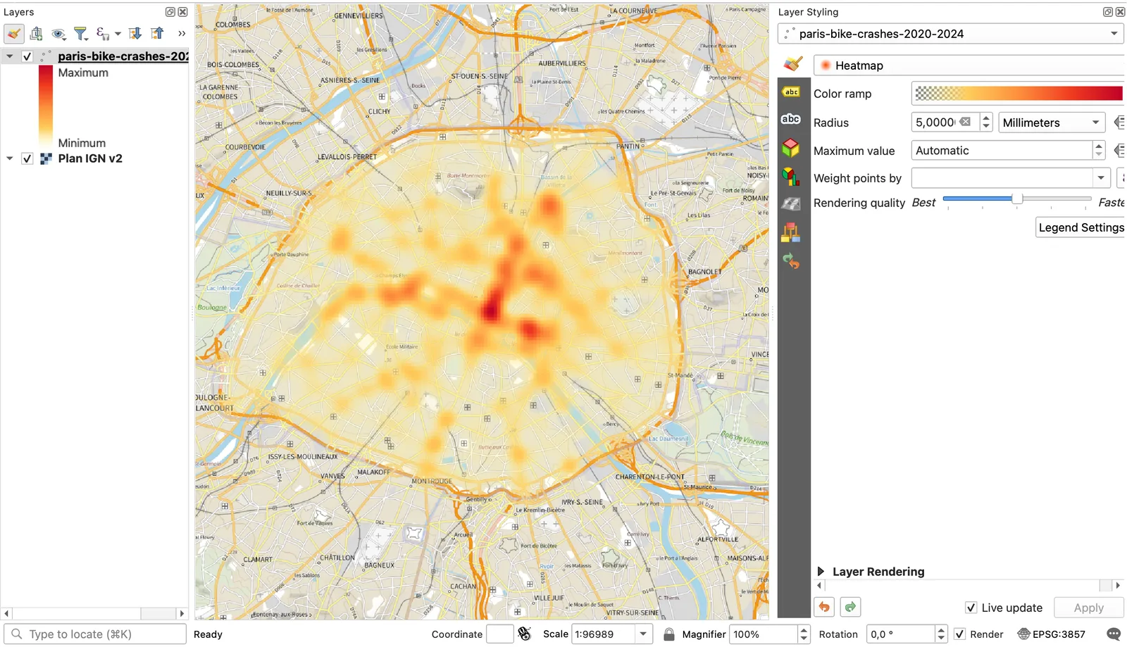
That took 24 clicks and two typed values, about 1 minute 10 seconds. The catch is in the units. A radius in millimetres means each point spreads over 5 mm of screen: 500 m of ground at 1:100,000, but 50 m at 1:10,000. The map you see depends on the zoom. Maximum value is Automatic, so red always means "the hottest spot in this view". You can't read a value, clip it or reuse it in another tool.
Use it when: you want a first look at where points cluster, in a minute. Skip it when: the map goes in a report. You need Method 2 for that.
Method 2: The Heatmap (Kernel Density Estimation) tool
The Processing tool writes a raster where every pixel holds a density value. It works in the units of the point layer, so the first step is to make sure those units are metres.
Reproject the points to metres
Processing Toolbox, search "reproject", open Reproject Layer, set the target CRS to a projected one. In France that is EPSG:2154 - RGF93 / Lambert-93; elsewhere, the UTM zone of your area. Run.Run Heatmap (Kernel Density Estimation)
Search "heatmap" in the toolbox. SetPoint layer to the reprojected layer, Radius to 250 meters and Pixel size X to 10. The rows and columns update by themselves: 1,008 by 1,797 for Paris.Style the raster
In the Layer Styling panel, set the render type toSingleband pseudocolor, pick YlOrRd, make its first colour transparent and click Classify. Untick the two point layers so they don't hide the heat.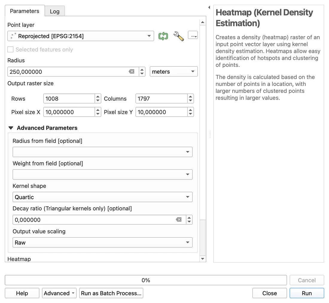
From the CSV on disk, this took 38 clicks and 6 typed fields, about 2 minutes, of which QGIS computed for 2 seconds. The output values are "raw": a sum of kernel weights, not crashes per square kilometre. Read them as more or fewer, and say so in the legend.
Use it when: the heat map goes into a layout, a report or another analysis. Skip it when: the reader will ask "how many?". Method 3 answers that.
Radius: the setting that decides what your map says
The radius is how far each crash spreads its weight. On the same 6,041 points, it changed which place in Paris came out hottest.
| Radius | Separate red areas (half the maximum or more) | Red area | Hottest place | Compute time |
|---|---|---|---|---|
| 100 m | 7 | 0.04 km² | Rue de Rivoli at rue Saint-Antoine, near Saint-Paul | 0.4 s |
| 250 m | 10 | 0.48 km² | Same spot near Saint-Paul | 1.8 s |
| 500 m | 5 | 1.76 km² | Châtelet, where boulevard de Sébastopol crosses rue de Rivoli | 4.2 s |
| 1,000 m | 2 | 8.28 km² | Châtelet | 14.0 s |
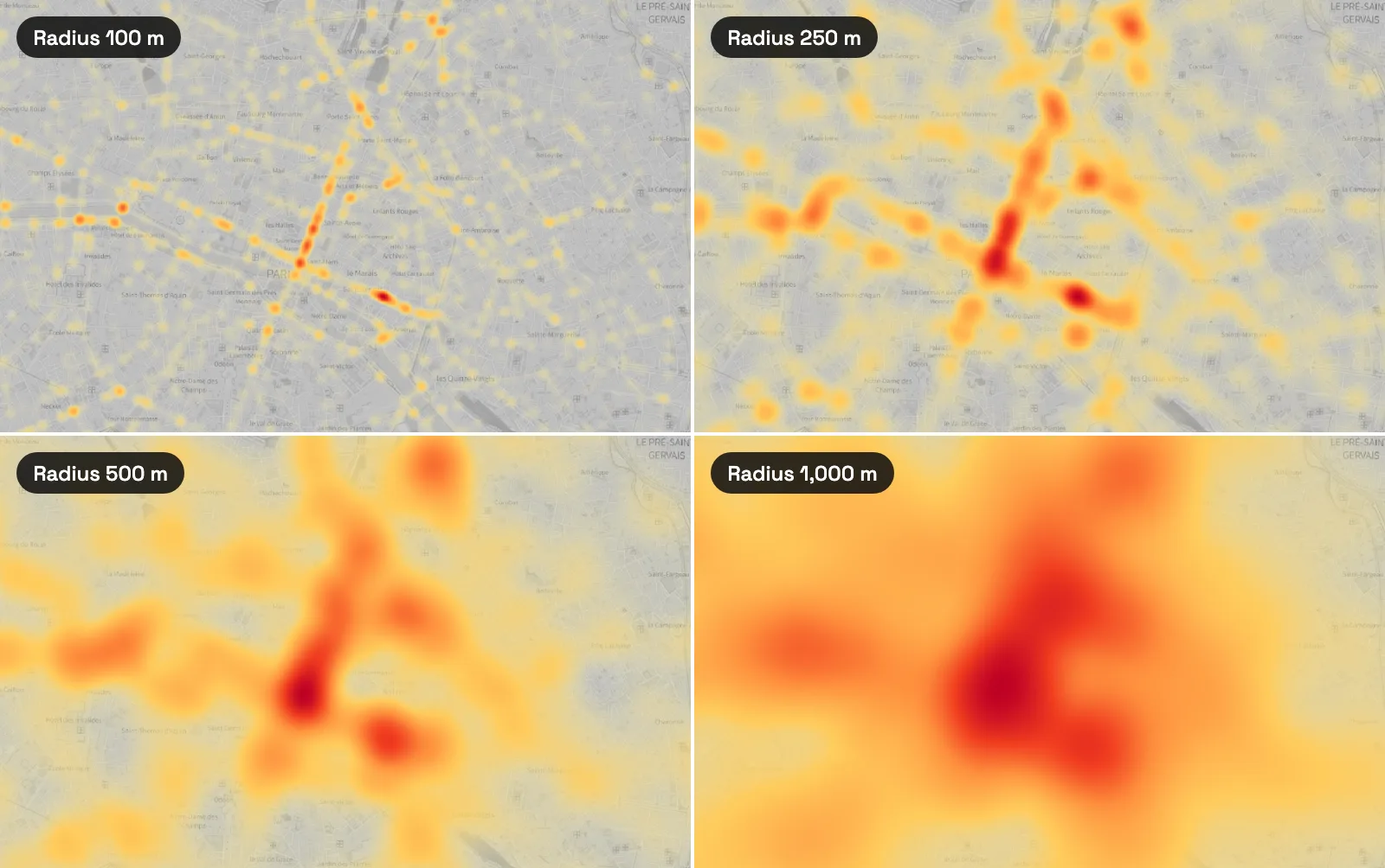
At 100 m the map shows single crossings and tells you little about the city. At 1,000 m it shows "the centre" and nothing you could act on. For street-level events like crashes, 150 to 300 m kept both the crossings and the corridors. Write the radius in the caption of every heat map you publish: without it, the reader can't tell which of these four maps they're looking at.
Pixel size changes the file, not the answer
With the radius fixed at 250 m, I ran the tool at five pixel sizes. The hotspots barely moved.
| Pixel size | File | Compute time | Separate red areas |
|---|---|---|---|
| 5 m | 29.0 MB | 3.2 s | 10 |
| 10 m | 7.3 MB | 1.8 s | 10 |
| 25 m | 1.2 MB | 0.2 s | 9 |
| 50 m | 0.3 MB | 0.1 s | 10 |
| 100 m | 0.1 MB | under 0.1 s | 8 |
A pixel between a tenth and a twenty-fifth of the radius looks smooth and stays small. At 100 m the count of red areas dropped to 8, and each pixel is wider than a city block. Below 10 m, you pay four times the disk space for the same map.
Method 3: Hexagons, when a heat map misleads
A heat map has no number in it. It also spreads crashes into places where none happened, like the Seine or a park, and shows "no crash" and "a few crashes" in almost the same pale yellow. A grid of equal hexagons with a count in each fixes all three: every cell has the same area, so the count is a density, and an empty cell is empty.
Create the grid
Processing Toolbox > Create Grid. Grid type Hexagon (Polygon), extent Calculate from Layer on the reprojected points, horizontal and vertical spacing 300 m, grid CRS Lambert-93. Run.Count the crashes in each cell
Count Points in Polygon: polygons = the grid, points = the reprojected crashes. Run. QGIS adds a NUMPOINTS field.Style by count
In Layer Styling, chooseGraduated, value NUMPOINTS, ramp YlOrRd, mode Pretty Breaks, then Classify.Hide the empty cells
Right-click the layer,Filter…, type "NUMPOINTS" > 0.From the CSV, that is 55 clicks and 7 typed fields, about 2 minutes 50 seconds. After Method 2, with the points already reprojected, it is 37 clicks, about 2 minutes.
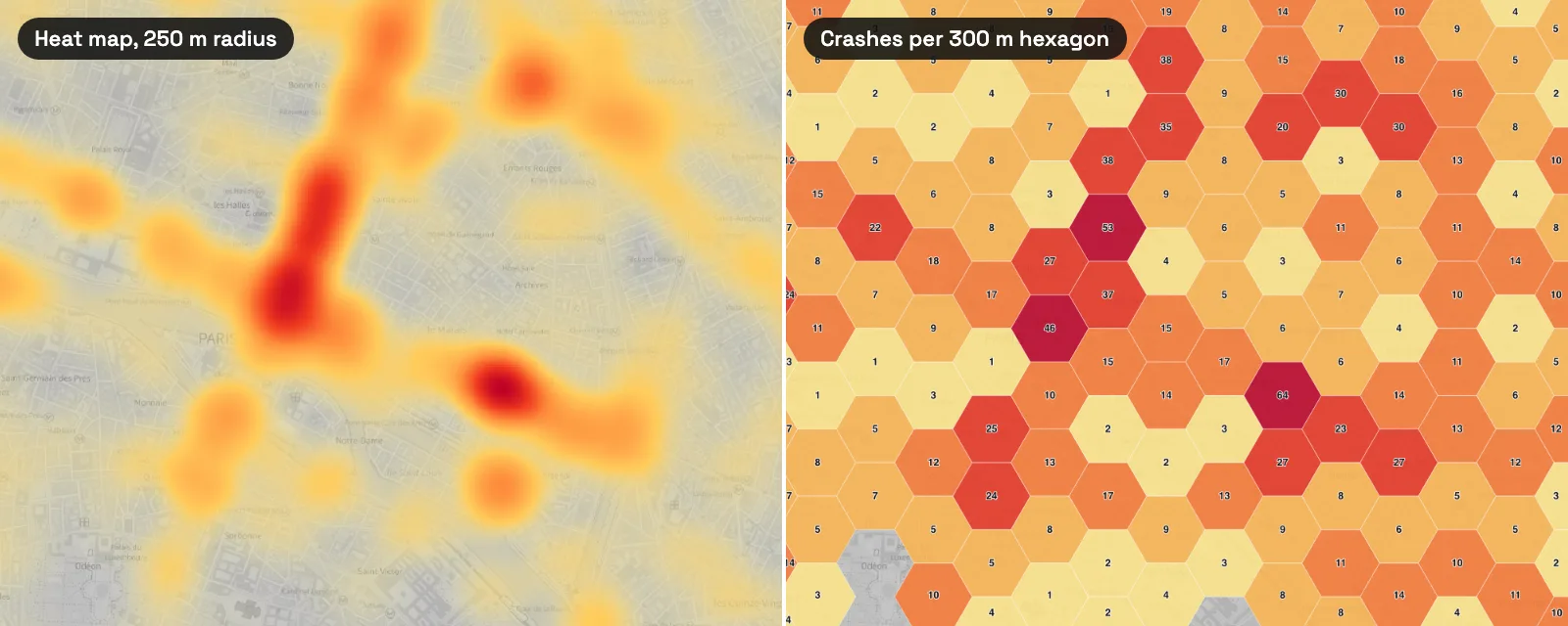
Across Paris, 1,453 hexagons of 300 m touch the city, each 7.8 hectares. 362 of them had no crash in five years. Four had 40 or more, and the busiest had 64. Those zeros are information a heat map cannot give you.
The class method matters as much as the grid. With Equal Count (Quantile), the darkest colour went to 249 hexagons, from 8 crashes to 64, so 23% of the cells with a crash shared the colour meant for the worst. Pretty Breaks in steps of 10 kept the darkest colours for the handful of cells above 40.
Use it when: the reader will compare places or ask for numbers. Skip it when: the points are so few that most cells hold 0 or 1. A plain point map reads better then.
Four traps that make a heat map lie
1. A radius in degrees
The Kernel Density tool reads the radius in the units of the layer's CRS, and a CSV of latitudes and longitudes is in degrees. On the unprojected crash layer, a radius of 250 gave a raster of 52 by 52 pixels, each 10 degrees wide, stretching from longitude −248° to +272°: one blob holding every crash, the whole planet coloured. The run finished without an error.
A smaller number in degrees fails more quietly. A radius of 0.0025° is 278 m north to south but only 183 m east to west at the latitude of Paris, so every crash becomes an oval.
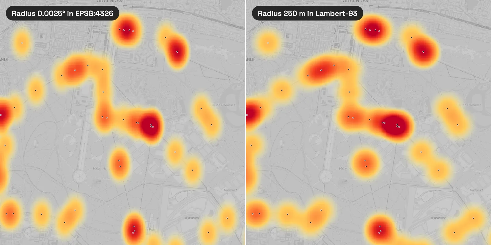
Web Mercator (EPSG:3857), the CRS of most web basemaps, has the opposite problem: its units are called metres, but at 48.9° north a "250 m" radius covers 164 m of ground. Reproject to a local projected CRS before you run the tool. What a CRS is explains why degrees and web metres both break distances.
2. The edge of your data
A heat map assumes there is nothing beyond your points. Paris has 2,954 more bike crashes just across the city limit, in the three neighbouring départements. With only the Paris crashes, the strip within 250 m of the limit read 15% lower than when I added the suburban ones, over 13 km². At 500 m the strip read 10% low over 25 km². In the other direction, with a 1,000 m radius, 3.1% of the heat landed outside the city, where I had used no data at all.
The fix: load your points at least one radius beyond your study area, run the tool, then clip the raster to the boundary.
3. Counts are not risk
The three maps below use the same 6,041 crashes, counted by arrondissement.
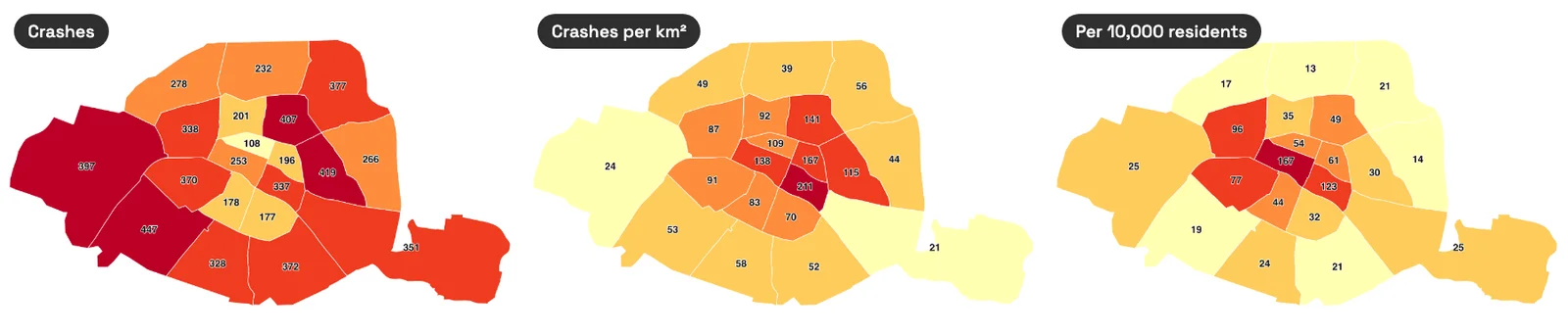
Raw counts favour big arrondissements, density per km² favours the centre, and per resident favours the 1st, where few people live and many pass through. None of them is a risk. For crashes, the right denominator is how many people ride there. The city's bike counters answer part of it: over the 13 months to 10 October 2026, the two busiest of its 79 counting sites were boulevard de Sébastopol (6.31 million bikes) and rue de Rivoli (4.35 million). Those are the two arms of the red cross on every heat map above. Without traffic data, title the map "where crashes happen", not "where it is dangerous".
4. A colour scale that moves
The Heatmap renderer rescales its colours to the hottest pixel in view, and the KDE tool writes raw values with no unit. Two heat maps side by side can share a colour and mean different numbers. When you compare years or cities, fix the maximum by hand in both: Maximum value in the renderer, Max in the raster's symbology.
Export the heat map as a print layout
A PDF needs a title, a legend and a scale bar. In QGIS 3.44, from the styled heat map:
New layout
Project > New Print Layout, type a name. An A4 landscape page opens in the layout designer.Add the map
Add Item > Add Map, drag a box on the page, then Set Map Extent to Match Main Canvas Extent in the item properties.Add the title, legend and scale bar
Add Label for the title. Add Legend, and tick Only show items inside linked map so hidden layers drop out. Add Scale Bar, units in kilometres.Export
Layout > Export as PDF, name the file, Save.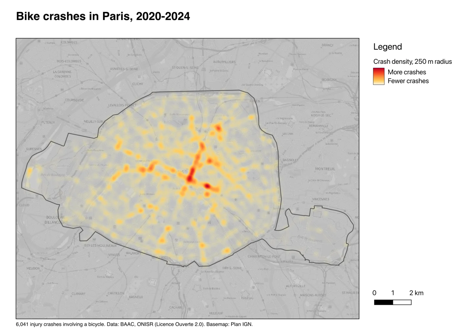
That is 22 clicks and 3 typed fields, about 1 minute 20 seconds, plus 25 seconds for QGIS to write the PDF while it fetched the basemap tiles. Two things to fix before you send it. The raster legend shows the band name "Band 1 (Gray)" and the raw values; rename them under Legend Settings in the symbology, as above. And the scale bar defaults to metres, with labels that collide; switch it to kilometres.
One sentence to an AI agent
We build one of these tools, AI Agent, a chat panel inside QGIS that runs the steps in the project you have open. This section is about our own tool.
The three methods above share the same chores: load the CSV with the right CRS, reproject, pick a radius, build the grid, style, lay out. In a QGIS project with only the Plan IGN basemap loaded, I typed one sentence (the folder path is shortened here):
Make a heat map of the bike crashes in …/paris-bike-crashes-2020-2024.csv (lat and lon in WGS 84): a kernel density raster in Lambert-93 with a 250 m radius, a 300 m hexagon grid of crash counts to compare, and an A4 PDF map with a title, legend and scale bar saved next to the CSV.
2:34min
from Send to answer
20
actions in one message
6,041
crashes, checked in the hexagon counts
1
approval click
It loaded the CSV as WGS 84 points, reprojected them to Lambert-93, ran the kernel density at 250 m with 25 m pixels and built the hexagon grid. Its first grid missed 7 crashes on the edge of the city; it said so, extended the grid and checked that the 2,450 hexagons added up to all 6,041 crashes before exporting. It saved the density raster as a GeoTIFF, the hexagons as a GeoPackage and an A4 PDF with both maps side by side, then checked the page for clipping. In the Balanced permission mode it asked once before writing files; I clicked Allow for this run, and that wait is inside the 2 minutes 34 seconds.
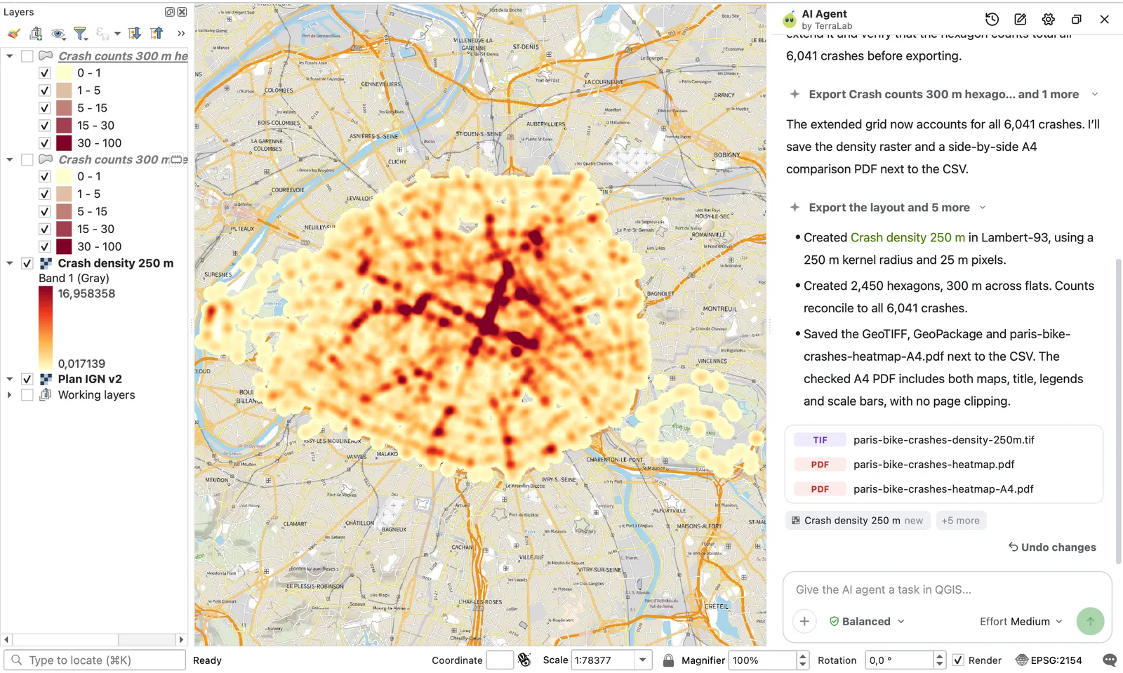
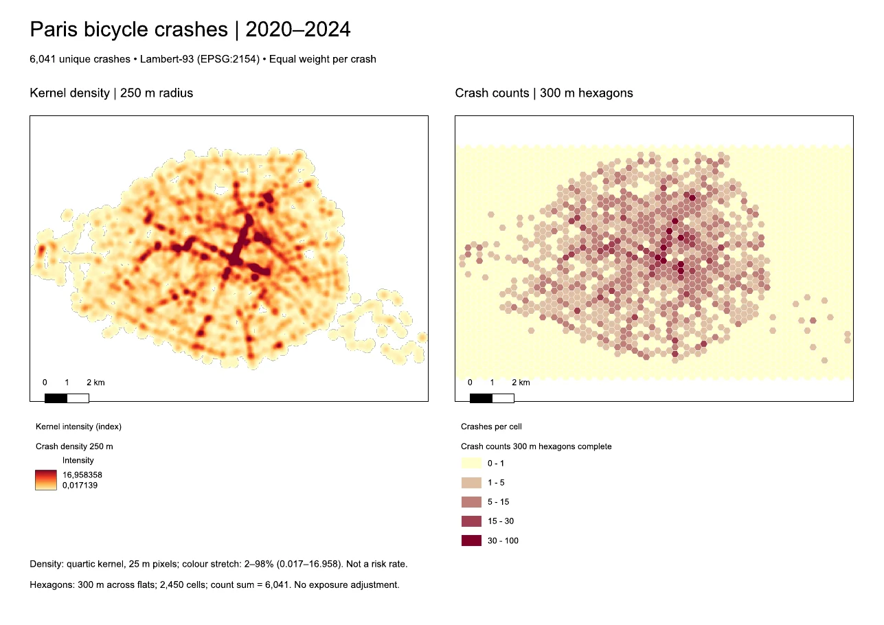
Two things I'd change in that PDF: the density legend shows raw values, 0.017 to 16.96, and the hexagon map keeps the empty cells around Paris. One more sentence fixes either. Doing the same by hand, Method 2, the hexagons and the layout come to 97 clicks and 14 typed fields, about 5 minutes 40 seconds at an expert's pace. Typing the sentence takes about 80 seconds at the same typing speed.
Try it free in QGIS, no card needed
Use it when: you want the heat map, the counts and the PDF without walking through five dialogs, or you aren't sure which CRS to use. Skip it when: you only want a quick look at a layer already on screen. The Heatmap renderer does that in a minute.
What to remember
- The Heatmap renderer is a style: fast, nothing saved, and its hotspots change with the zoom. The Heatmap (Kernel Density Estimation) tool writes a raster you can measure and print.
- The radius decides the story. On 6,041 Paris bike crashes, 100 m and 250 m put the hottest spot near Saint-Paul; 500 m and 1,000 m moved it to Châtelet. Write the radius in the caption.
- Pixel size changes the file, not the map: 29.0 MB at 5 m against 1.2 MB at 25 m, with the same hotspots.
- Reproject to metres first. On the raw latitude and longitude layer, a radius of 250 was read as 250 degrees and coloured the whole planet.
- Use hexagons when readers need numbers: 1,453 cells of 300 m, 362 of them empty, 64 crashes in the busiest. Counts are not risk; divide by traffic when you have it.
- AI Agent made the heat map, the hexagons and an A4 PDF from one sentence in 2 minutes 34 seconds, where the same work takes about 97 clicks by hand.
Questions people ask
How do I make a heat map in QGIS?
Load your points, then either set the layer's style to Heatmap in the Layer Styling panel, or run Heatmap (Kernel Density Estimation) from the Processing Toolbox to get a raster. For the raster, reproject the points to a CRS in metres first and choose a radius in metres.
What is the difference between the Heatmap renderer and the Kernel Density tool?
The renderer draws the heat on screen from the points, with a radius in millimetres or pixels, and saves nothing. The tool computes a raster of density values with a radius in map units. Use the renderer to look, the tool to publish or analyse.
What radius should I use for a heat map?
Start near the distance at which one point should influence its neighbours. For crashes along streets, 150 to 300 m kept crossings and corridors visible in Paris. Try two or three values and keep the one that answers your question, then state it on the map.
Why is my QGIS heat map one big blob?
The points are almost certainly in degrees, usually EPSG:4326, and the radius was read as degrees. Reproject the layer to a projected CRS with Reproject Layer and run the tool again with a radius in metres.
Can I make a heat map from an Excel or CSV file?
Yes. Save the sheet as CSV with one column for longitude and one for latitude, load it with Add Delimited Text Layer, set the geometry CRS to EPSG:4326, and continue with any method above.
Should I use a heat map or a hexbin map?
A heat map shows where points concentrate. Hexagons show how many points fall in equal areas, including zero. Use the heat map to draw attention, hexagons when people will compare places or quote numbers.
Is there a free heat map maker?
QGIS is free and open source, and both of its heat map methods are built in, with no plugin. AI Agent has a free plan and builds the same maps from a sentence inside QGIS.
Heat maps start from points, and downloading OSM data in QGIS is the fastest way to get points for shops, schools or trees anywhere. If you're choosing between AI tools for QGIS, the best AI plugins for QGIS compares them, and the QGIS AI hub lists the rest.