Colored site plan: the same block four ways
Published
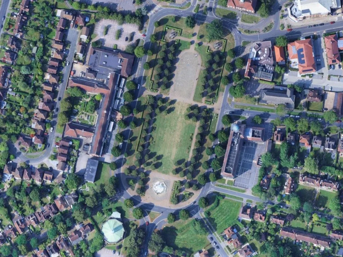
A colored site plan is a black and white site plan with fills: warm grey or white for buildings, grey for roads, green for lawns, round green blobs for trees, blue for water. That is the whole recipe, and the reason it takes an afternoon is that somebody has to paint inside every line. This post shows the same block of Letchworth Garden City rendered four ways from the aerial image, using AI Edit, the plugin we make at TerraLab for QGIS. It gives you every prompt, and says plainly where the model made things up.
 . It gives you every prompt, and says plainly where the model made things up.
What is a colored site plan?
A colored site plan, called a rendered or illustrative site plan in the United States and a colour masterplan in the United Kingdom, is a top-down drawing of a site with flat colours or textures applied to each surface, so a non-technical reader can tell buildings from gardens from roads at a glance. It goes on the cover of a planning application, the first board of a competition entry, and the page of a sales brochure that shows the whole scheme. The geometry underneath is the ordinary site plan. The colour is the communication.
It is a presentation drawing, not a legal one. Nobody measures from it, and in most jurisdictions the dimensioned plan is a separate sheet.
The three ways people make one
By hand. Print the line plan, colour it with markers or pencils, scan it. The warmest look, and the one clients still respond to most. An hour or two for a block this size, longer if you are careful with the trees.
With AI Edit, from the aerial image. This is our method, and the one used for every image below. AI Edit is a plugin for QGIS: you draw a zone on your imagery, type the look you want, and it adds a new raster layer to the map in under a minute, aligned with the imagery underneath. It is the only one of the three where the coloured plan is still a map.
In Photoshop or Illustrator. Export the line plan, build one layer per surface, fill each with a colour or a texture, add a drop shadow under the buildings. The standard studio method. A couple of hours the first time, forty minutes once you have a template. The result is not georeferenced, so it drifts from the drawing the moment the design changes.
How the four images below were made
So there is no mystery about where the pictures come from: every one of them is a layer that AI Edit added to my QGIS project, exported at the same extent as the satellite image.
I ran that four times with four prompts. Nothing was touched up afterwards.
Four looks from one image
1. Flat, four classes
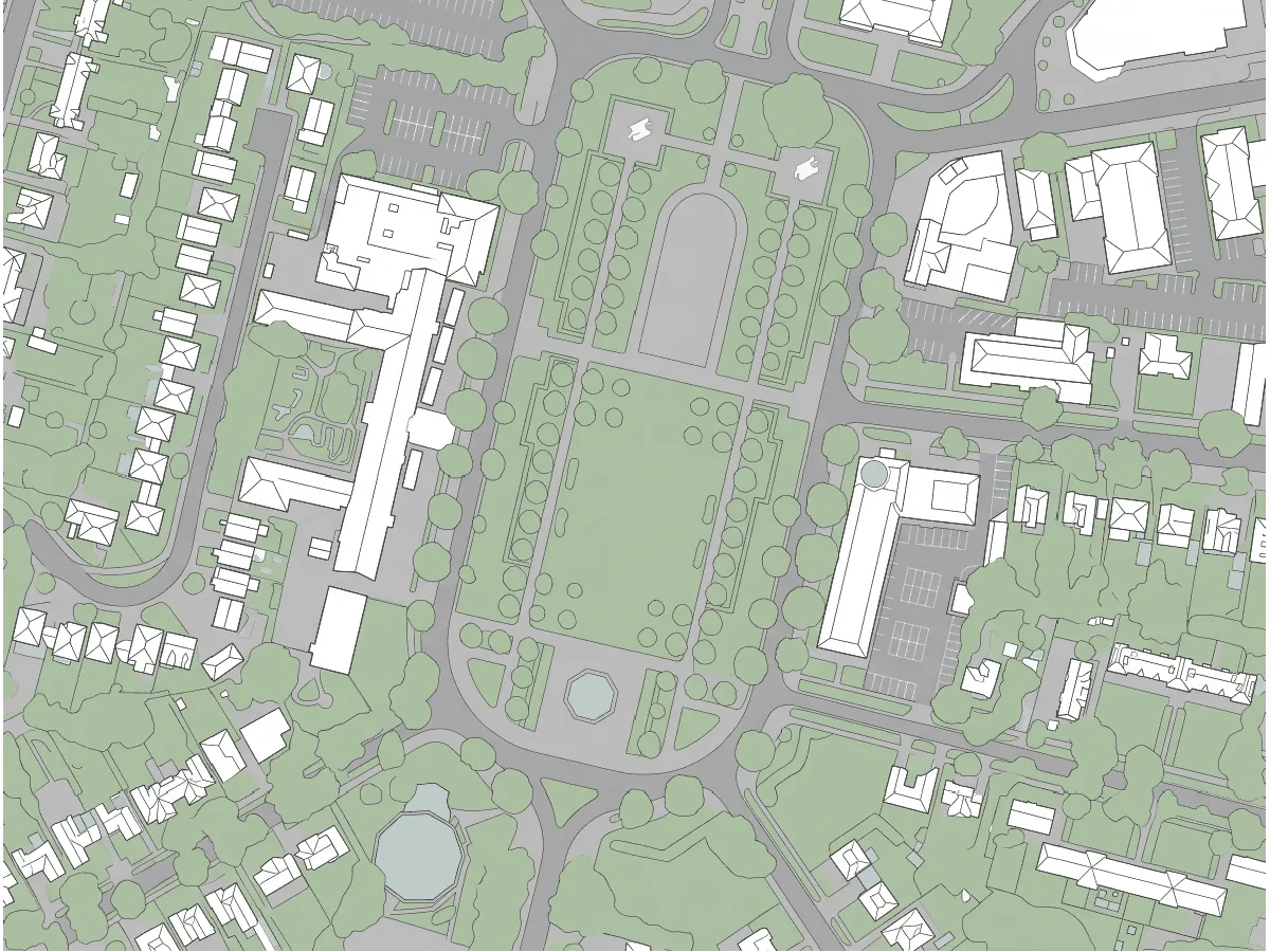
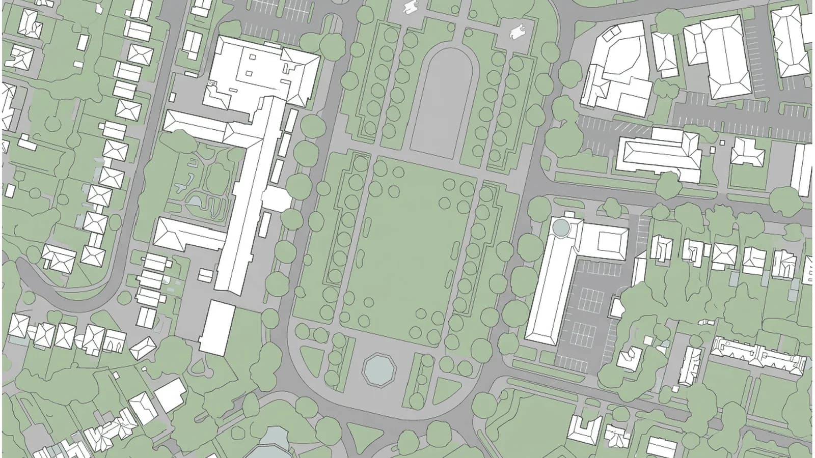
The plain coloured site plan: white footprints, grey roads, pale green lawns, pale blue water. This is the one the site plan post is about, prompt included, so I will not repeat it here. 29 seconds, every footprint in place, one error: the copper-roofed octagonal building in the south-west came out as a pond. The three looks below start from the same aerial image, not from this plan.
2. Watercolor
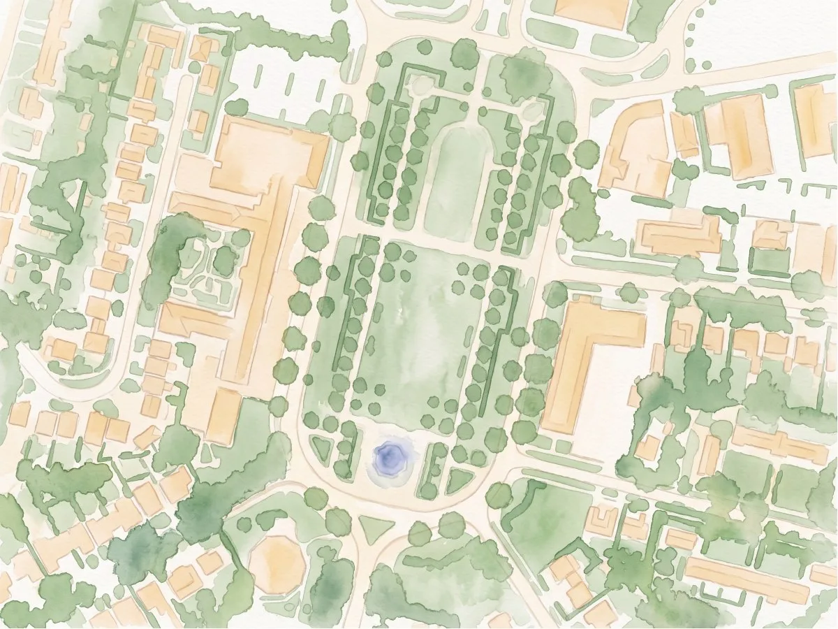
Buildings as pale ochre washes, the avenues as mottled sage, the fountain as a single indigo drop. The look clients ask for when they say they want it to feel human.
Transform into a Stamen-style watercolor map with soft pastel washes, organic
edges, and gentle paper texture. Roads as faint cream lines, vegetation as
mottled sage, water as washed indigo, buildings as pale warm ochre blocks.
Keep every building footprint, road and tree in its exact position. Top-down
view, suitable for editorial print.
Around 30 seconds. Nothing invented. The washes soften the footprints by a metre or so, which is fine for a cover and wrong for a drawing you will measure from.
3. Pencil
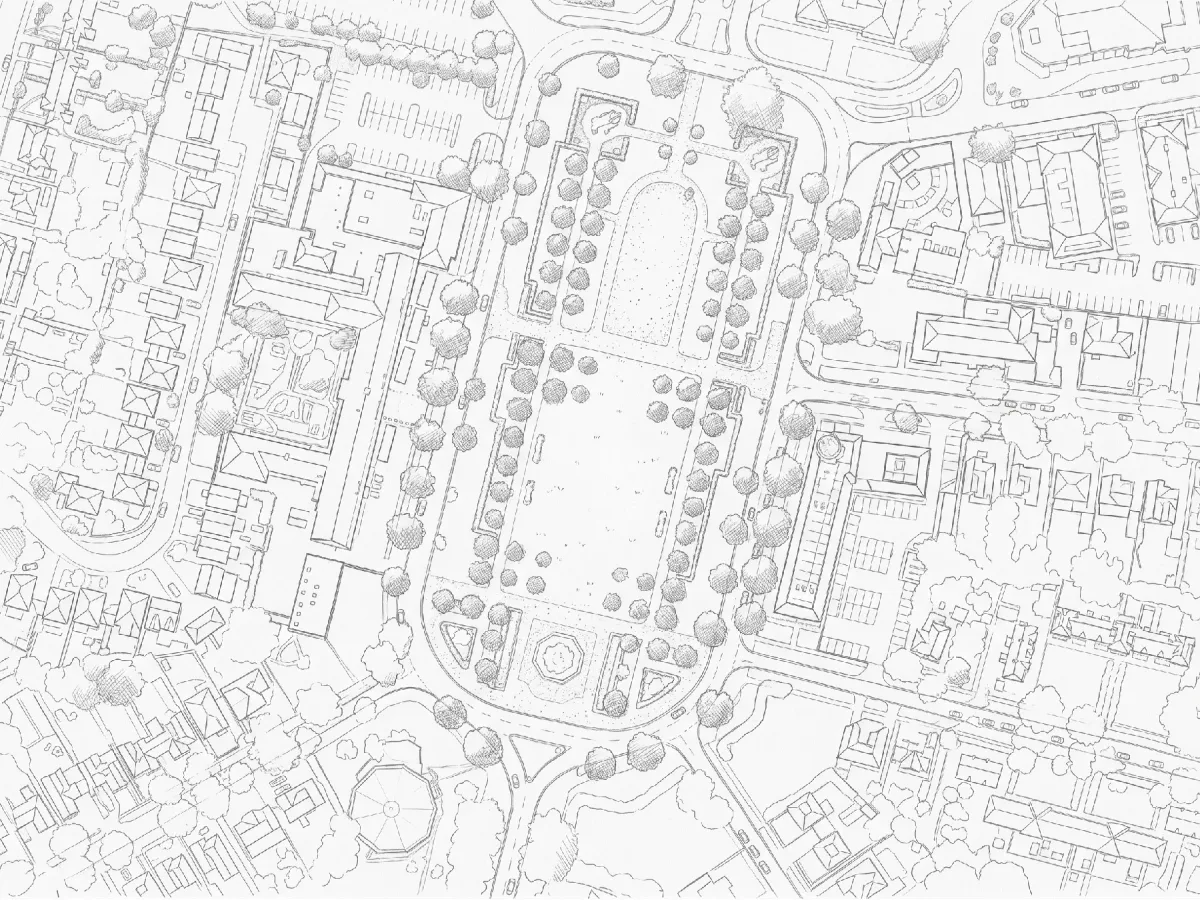
Every roof ridge, every parking bay, hatched canopies, stippled gravel. It drew the octagonal building correctly, which the flat plan did not.
Transform into a hand-drawn pencil sketch site plan. Fine graphite line work
for every building outline and road edge, light cross-hatching for tree
canopies and vegetation, stippling for paving, white paper background. Keep
every building footprint, road and tree in its exact position and shape.
Top-down view, same extent as the input.
20 seconds. This is the most accurate of the four and the one I would put in a report. It is not coloured, so if you want colour, run it, then use it as the base for the hand or Photoshop route above. That is a trace you did not have to draw.
4. Glossy
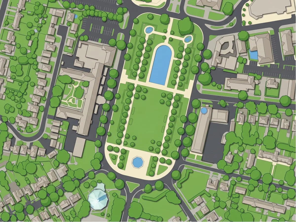
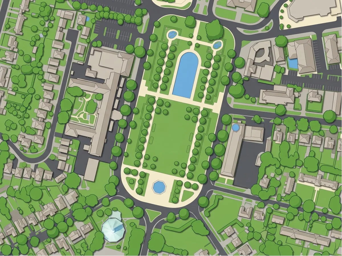
Drop shadows under the buildings, saturated lawns, round canopies. The most presentation-ready of the four and the least honest.
Transform the area into a glossy presentation-ready colored site plan with
high-contrast flat color blocks: buildings in warm light grey with a soft drop
shadow, roads in charcoal, paths in cream, lawns in fresh green, tree canopies
as round mid-green blobs with a darker rim, water in clear blue. Keep every
building footprint, road and tree in its exact position and shape. Top-down
view, same extent as the input.
Over a minute. It is the one people will want, and it is the one with two inventions: the gravel oval at the north end of the park became a long blue pool, and two small ponds appeared beside the civic buildings where there is only lawn. The prompt said "water in clear blue" and the model found some. If you use this style, say "there is no water on this site except the fountain", or do not mention water at all.
Where AI colouring does not work
Two of the four looks were geometrically right everywhere I checked, watercolor and pencil. Two had one invention each, both involving water. That is the pattern I would expect you to see too: the more finished the style you ask for, the more the model wants to complete the picture, and water is what it reaches for.
- When the drawing has to be measured from. The washes and shadows move edges by up to a metre at this scale. Use the flat style, or trace by hand. These are renders, not survey documents, and none of them belongs on a sheet that carries dimensions.
- When the site has no water and you mention water. Leave it out of the prompt.
- When the imagery has hard shadows. A summer afternoon image gives the model shadows to misread. Winter or morning imagery is cleaner.
- When you need the design on it. These four are the existing site. To show a proposal, draw the proposal on the map first with the AI Edit Mark up tool, then ask for the render. That is a different job and a different prompt.
- When you need the shapes, not the picture. If what you actually want is building outlines with real geometry you can edit and measure, a render is the wrong tool. AI Segmentation is built for that.
Which one to use
Pencil for the report, because it is the most accurate and the most legible in black and white. Watercolor for the cover and the client email. Flat for anything you will draw over. Glossy for the sales board, with the water sentence fixed and every pond checked against the image.
Frequently asked questions
Is the coloured plan georeferenced? Yes. Every render is a GeoTIFF in the coordinate system of your imagery, so it sits on the QGIS map at true scale, and you can put it straight into a print layout with a scale bar.
Can I combine looks? Run the pencil first, then use it as the input layer for a second edit with the watercolor prompt. The line work anchors the wash.
Can I submit one of these with a planning application? As an illustrative sheet, that is between you and your planning authority, and each render carries an AI-generated tag you should keep. As the dimensioned site plan the application asks for, no. That drawing has to be measured and drawn, and none of these four is.
Which QGIS versions? QGIS 3.22 and later, and QGIS 4, on Windows, macOS and Linux.
Next step
Load your site in QGIS, draw the zone, paste the pencil prompt. If the lines are right, you have the base for every other look.
A coloured plan for a brownfield site usually has to keep the existing slabs and sheds on it rather than paint over them. The greenfield vs brownfield page covers how each type of site actually reads from the air.
More on what AI can and cannot do inside QGIS on the QGIS AI hub.